ShopDreamUp AI ArtDreamUp

Deviation Actions


Suggested Deviants


Suggested Collections


You Might Like…


Featured in Groups


Description
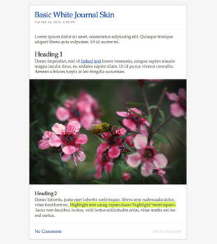
This is the second Journal CSS I'm releasing. It was designed and coded today, I have just finished it (it's 4:30 AM!) and I'm especially proud of this one because I made it without any help! I have to admit that I start enjoying making journal CSSs ") I might make a Gallery CSS that matches this journal. So stay tuned!
I might make a Gallery CSS that matches this journal. So stay tuned!
 See this journal in use here:[link] sorry for the title
Get the matching Gallery CSS here:
[link]
As the title says, this one is really simple, just download the css file and install it to your journal and you're done!
If you want big titles in your journal entry just type this < div class="title">and add your title here</ div> and remove the spaces before "div".
The journal was tested in Firefox, IE8 (not so good) and Opera and it's best viewed on lower resolutions because of its 600px max width. But it doesn't look bad on high resolutions either, such as mine (1920x1200).
If you have any questions or you can't make it work feel free to ask.
Pattern used: [link] by ~TechII
I didn't add copyright or link back to my profile to this css, but if you want you can link others to this page so they can find this css easier.
You can use this freely, without any credit, just don't repost it or claim it as your own!
Enjoy!
People using it:
 ~digitalTouch
  ~vhartley =Roses-to-Ashes ~ElysianSkies =Leona629 *BlackSoniko *Akonza *ana-ecir *CHU-renji *Forunth *1m3 *Angel-of-the-trees *Doppios-Reign
 Important Update! Those of you who have downloaded this css before September 7 2009 please download the css again, OR re-upload the images from the zip to your own image host and replace the links in the css because photobucket messed up my images and I had to change the links so the images would show right. But problem is solved now. Sorry for the inconvenience!
[link]
As the title says, this one is really simple, just download the css file and install it to your journal and you're done!
If you want big titles in your journal entry just type this < div class="title">and add your title here</ div> and remove the spaces before "div".
The journal was tested in Firefox, IE8 (not so good) and Opera and it's best viewed on lower resolutions because of its 600px max width. But it doesn't look bad on high resolutions either, such as mine (1920x1200).
If you have any questions or you can't make it work feel free to ask.
I didn't add copyright or link back to my profile to this css, but if you want you can link others to this page so they can find this css easier.
You can use this freely, without any credit, just don't repost it or claim it as your own!
Enjoy!
Comments62
Join the community to add your comment. Already a deviant? Log In
I'm a bit late with my critique, so let's do it!
When looking at this you can easily see, that it has no special layout or is anything challenging, if(!) you are good with CSS. But keeping in mind that this is your second template you have made, you did a nice job.
The colors work well together and are very eye-friendly(do you say that? lol). It's not too dark and not too bright.
I'm just not sure if the contrast could be slightly increased. Especially for the content area the colors are a bit too much of the same shade, so that it kinda merges if you take a quick look. And it can appear to be a bit boring , if there are no thumbs or any other highlights in that area.
The top and the orange font looks very nice, but related to that the headline looks kinda unimportant - still that color works fine. I'm just lacking words to explain it right. Maybe some little icon in front or a border will work there, to give it some more attention.
And i could imagine that a border around the boxes could be nice too, to bring out the content a bit more.
Would like to see more of you! <img src="e.deviantart.net/emoticons/r/r…" width="15" height="15" alt="
Critique courtesy of *devCRIT